---------- ---------- ---------- ---------- ---------- ---------- ---------- ----------
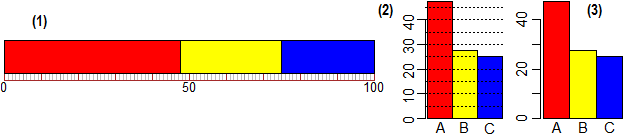
# Besides what we have seen in (L) and (N1), there are many ways to get simply bar and
# circular charts:
da = c(237.5,137.5,125); co = c("red","yellow","blue")
StripNames = c("A","B","C"); StripC(da,co) # (1)
BarNames = c("A","B","C"); BarC(da,co) # (2)
noGrid=1; BarNames = c("A","B","C"); BarC(da,co) # (3)
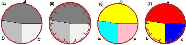
PIE2C( da, c("grey50", "grey75", "grey95") ) # (4)
PieC( da, c("grey50", "grey75", "grey95") ) # (5)
PIE_( da, 4 ) # (6)
Pie_C( da,co, 27) # (7)
Pie2( da ) # (8)
PIE2( da ) # as (8) without grid [as PIE_(da,1)]
|
 |
 # In USA from 1949 to 1966 several statistical studies (Framingham Study) on the
# cardiovascular disease of the people was conducted. Here are the bar charts (for
# different cities, in different age groups) of those affected by coronary thrombosis
# (A: between 40 and 60 years of age, B: between 30 and 70, C: between 45 and 65),
# divided into non-smokers (grey) and smokers (brown); the incidence on 1000 people is
# represented (from ABC Television).
# In USA from 1949 to 1966 several statistical studies (Framingham Study) on the
# cardiovascular disease of the people was conducted. Here are the bar charts (for
# different cities, in different age groups) of those affected by coronary thrombosis
# (A: between 40 and 60 years of age, B: between 30 and 70, C: between 45 and 65),
# divided into non-smokers (grey) and smokers (brown); the incidence on 1000 people is
# represented (from ABC Television).
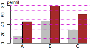 # To build different diagrams on the same reference system (↑) I can use the command:
# BARM(x, col, M, G) In x I put the data (0 between one group and another), in col
# the colors (0 between one group and another), in M the maximum height of the graph,
# in G the heights of the grid lines.
D = c(15.4,45.8,0,47.5,79,0,28.6,61.4)
co=c("grey","brown",0,"grey","brown",0,"grey","brown")
BARM(D, co, 80, (1:8)*10)
# data: 15.4 45.8 0 47.5 79 0 28.6 61.4
aboveX(permil",0)
underX("A",1); underX("B",4); underX("C",7)
# 0, 1, 2, ... are the abscissas of the beginning of the various columns
#
# Obviously with BARM I can also make single histograms:
# To build different diagrams on the same reference system (↑) I can use the command:
# BARM(x, col, M, G) In x I put the data (0 between one group and another), in col
# the colors (0 between one group and another), in M the maximum height of the graph,
# in G the heights of the grid lines.
D = c(15.4,45.8,0,47.5,79,0,28.6,61.4)
co=c("grey","brown",0,"grey","brown",0,"grey","brown")
BARM(D, co, 80, (1:8)*10)
# data: 15.4 45.8 0 47.5 79 0 28.6 61.4
aboveX(permil",0)
underX("A",1); underX("B",4); underX("C",7)
# 0, 1, 2, ... are the abscissas of the beginning of the various columns
#
# Obviously with BARM I can also make single histograms:
 chol = c(16,22,38,40,59,66)
BARM(colest, "yellow", 70, (1:7)*10)
aboveX("permil",0); underX(c("<200","<225","<250","<275","<300",">=300"),(1:6)-1/2)
# Incidence of coronary thrombosis by level (mg/dl) of cholesterol (people with high
# cholesterol levels have the risk of coronary damage 2-4 times greater than normal).
#
press = c(9.5,41,48.5,81.5)
BARM(press, "cyan", 81.5, (1:8)*10)
aboveX("permil",0); underX(c("<80","<90","<95",">=95"), (1:4)-1/2)
# Incidence of coronary diseases by level of diastolic pressure (men aged 40 to 49
# years).
Other examples of use
chol = c(16,22,38,40,59,66)
BARM(colest, "yellow", 70, (1:7)*10)
aboveX("permil",0); underX(c("<200","<225","<250","<275","<300",">=300"),(1:6)-1/2)
# Incidence of coronary thrombosis by level (mg/dl) of cholesterol (people with high
# cholesterol levels have the risk of coronary damage 2-4 times greater than normal).
#
press = c(9.5,41,48.5,81.5)
BARM(press, "cyan", 81.5, (1:8)*10)
aboveX("permil",0); underX(c("<80","<90","<95",">=95"), (1:4)-1/2)
# Incidence of coronary diseases by level of diastolic pressure (men aged 40 to 49
# years).
Other examples of use