
Example:
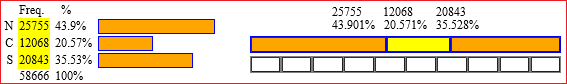
The inhabitants (in thousands) of the North, the Center and the South (of Italy):
|
[ the pie chart: see here; you can "read" the percentages: 44%, 21%, 35% ] |  |
HELP:
You can resize. You can draw 1, 2, 3 or 4 diagrams to compare them.
If you open the file by pressing the right mouse button you can select "open in a new window".
Go back, or reload the file, for a new data series, or CLICK to use a new window.
With Alt_Print you can copy the page and paste it into Paint or other applications.
Note.
If before the data you put [n] (n between 1 and 9) the n-th part is colored green (for example if you put [3] 16,37,18,11 you have a diagram with the 3rd part, which represents 18, colored green).
Another example:
Employed persons in Primary, Secondary and Tertiary sectors (in Italy):
1881  million of people  9.4     3.1     2.7
                        61.8%   20.4%   17.8%
1921  million of people  11.2    4.5     3.5
                        58.3%   23.4%   18.2%
1961  million of people   6.6    7.7     6.7
                        31.4%   36.7%   31.9%
2001  million of people   1.1    6.8    15.4
                         4.7%   29.2%   66.1%

Another one:
European population by age:
        age < 40     age ≥ 40
1950    82424685     59989300
          57.9%        42.1%
2000    87397462    100728850
          46.5%        53.5%

Strip diagrams can be used not only for percentage distributions. Two examples.
• (Solar) hour of sunrise and sunset (and daylight hours) around the 22 of several months in a particular Italian city:

I input the hours (with the fractional part in decimal form) before sunrise, the hours of light, the hours after sunset:
6.82, 10.63, 6.55
7.93, 8.9, 7.17
7.17, 10.84, 5.99
5.43, 13.9, 4.67
• Associate each letter with the fact that occurred in the year it represents:

......... Appointment of Charlemagne as Holy Roman Emperor
......... Death of Alexander the Great
......... End of the 1st World War
......... End of the 2nd World War
......... Expedition of the Thousand
......... First descent of man to the moon
......... Foundation of Rome
......... French Revolution
......... Killing of Julius Caesar
...... K Treaty of Aachen
I put in input:
48, 41, 71, 58, 27, 24, 31
247, 430, 279, 1079, 989, 211